CSS display grid put the magic 🪄 back into my layout
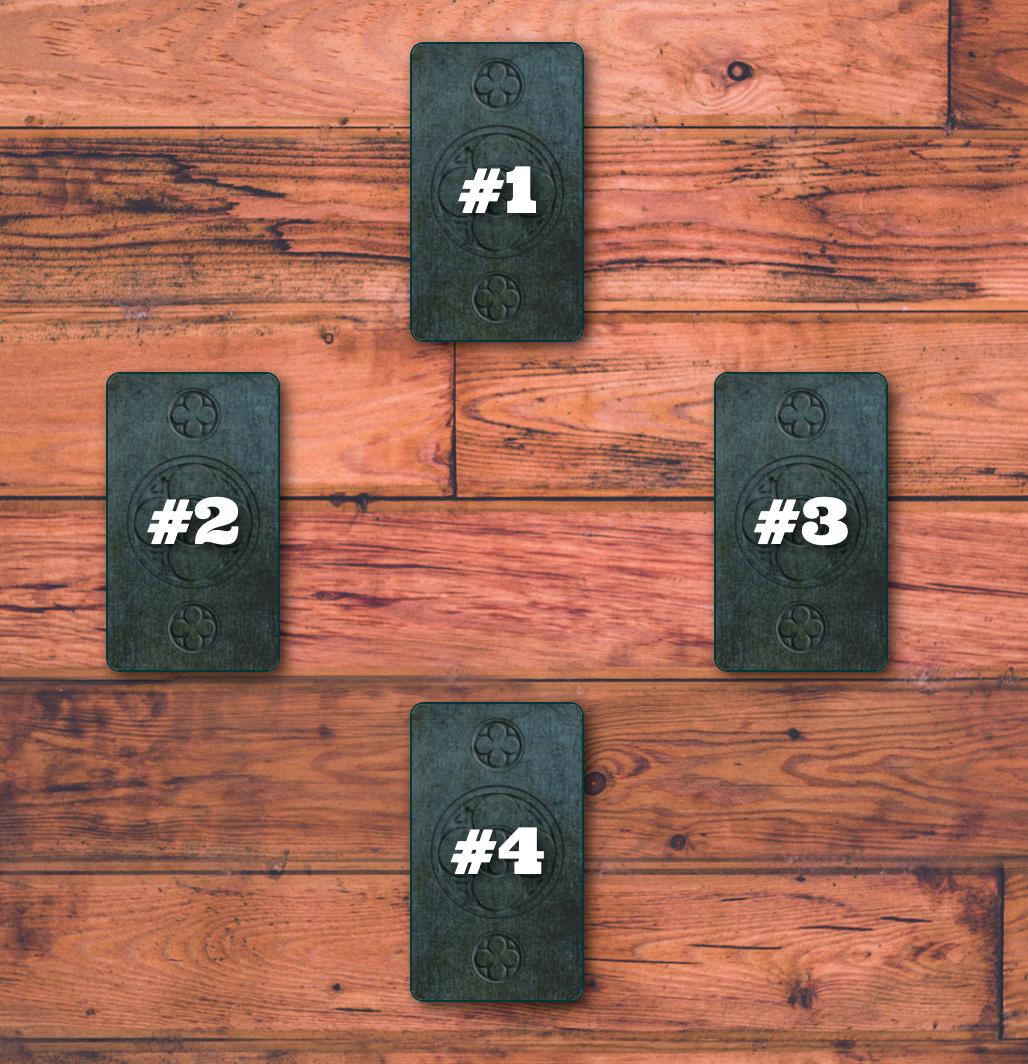
Back in 2018 I wrote this post about a refactor on my tarot-card-reading app that allowed me to scale the quantity of readings and quantity of cards per reading, but the cost was that I lost the ability to place the cards exactly where I wanted them to go on the screen.
| Before Scaling | After Scaling |
|---|---|
 |
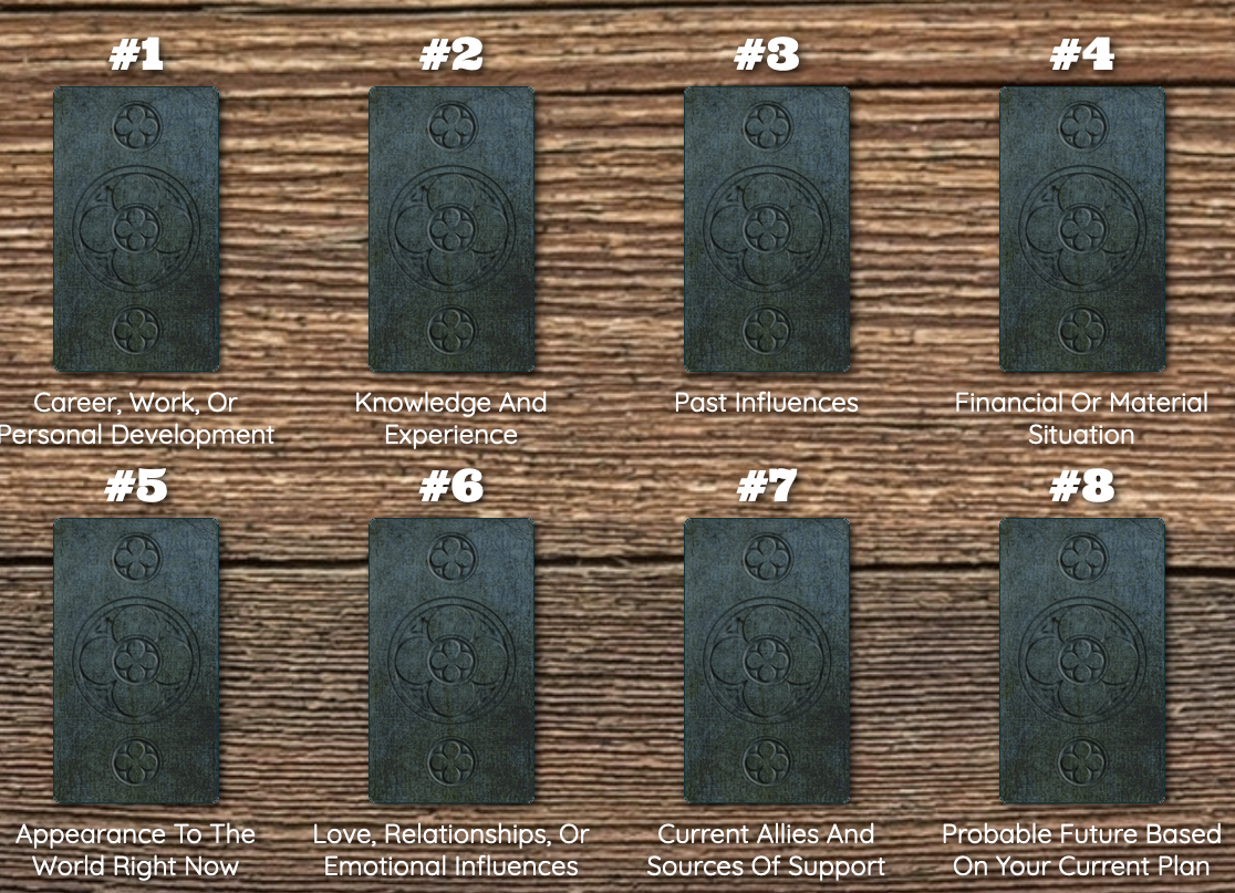 |
| This 4-card spread had individually hand-coded, curated, artisenal positioning HTML | This 8-card spread just spits out the right number of cards out into generic non-customized columns and rows. |
I was fine with that sacrifice at the time, but as time passed and folks familiar with real tarot spreads came to play with my app, I found myself apologizing for the boring rows. Fortunately, the last person I was apologizing to is a long time friend and fellow developer who gave me mentorship years ago. He knew exactly how to give me the kick in the butt I needed to stop telling this silly tale of defeat and just fix the dang thing.
I started the process by outlining my requirements for making realistic-looking tarot spreads appear on the screen:
- Position a specific card to an exact location on a on the screen
- Store the card’s exact positioning information somewhere so it can be rendered dynamically (spoiler: I put it in the database)
- Shrink or grow the size of the spread area to fit any size reading (a 1-card reading does not need a 10x10 grid)
- Make flexible, reusable classes for building grids and positioning cards on the fly
- BONUS: Cross a card (rotate 90 degrees) over another card
- BONUS: Overlap certain cards’ rows or columns so that the layout actually looks like a real tarot spread
CSS Grid for the Win
In my original implementation, I was using Twitter Bootstrap’s column & row system – which was limited in its capability. And now I know that there is some hot CSS technology that lets you put <div>s exactly where you want them on a screen. We’re talking about display: grid; and it’s been supported by all browsers since 2017. As I spend most of my time in the back end of Rails apps (which you probably wouldn’t guess by the front-end nature of my posts), I needed a refresher before digging into grid. I watched (and highly recommend) Brad Traversy’s CSS Grid Layout Crash Course. You’ll see in that video that there are different ways to use grid. I’m choosing to assign exact grid cell locations to my DOM objects, which I’ll explain below.
This is the spread I’ll use to demonstrate how I used grid to lay out my cards:

Requirement: Position a specific card to an exact cell on a grid
Before I get fancy, I like to hard-code whatever I’m doing to make sure it works, so that’s the approach I’ll take here. First we need a grid. This tarot spread has 3 columns and 3 rows, so we need a grid with 3 columns and 3 rows.
.grid-container {
  display: grid;
  grid-template-columns: repeat(3, 1fr);
  grid-template-rows: repeat(3, 1fr);
}
Then we need to position card #1 in row 1, column 2:
.card-1 {
  grid-row-start: 1;
  grid-row-end: 2;
  grid-column-start: 2;
  grid-column-end: 3;
}
Here’s how it plays out in the HTML:
<div class="grid-container">
  <div class="card-1">
    <p>#1</p>
  </div>
</div>
Repeat this process for each of the 4 cards. Now this this working proof-of-concept, I can move on to making it dynamic.
Requirement: Store the card’s exact positioning information somewhere so it can be rendered dynamically
Storing knowledge about a database object in the HTML doesn’t scale, so it’s better to store it in the database along with the appropriate object. To do that, I added a grid_column and a grid_row field to the reading_positions table in my database in order to store each card’s position in a given reading. After the database table was updated, I manually added the data to each reading_position (aka card in the spread). The data for our example cards in this spread looks something like this:
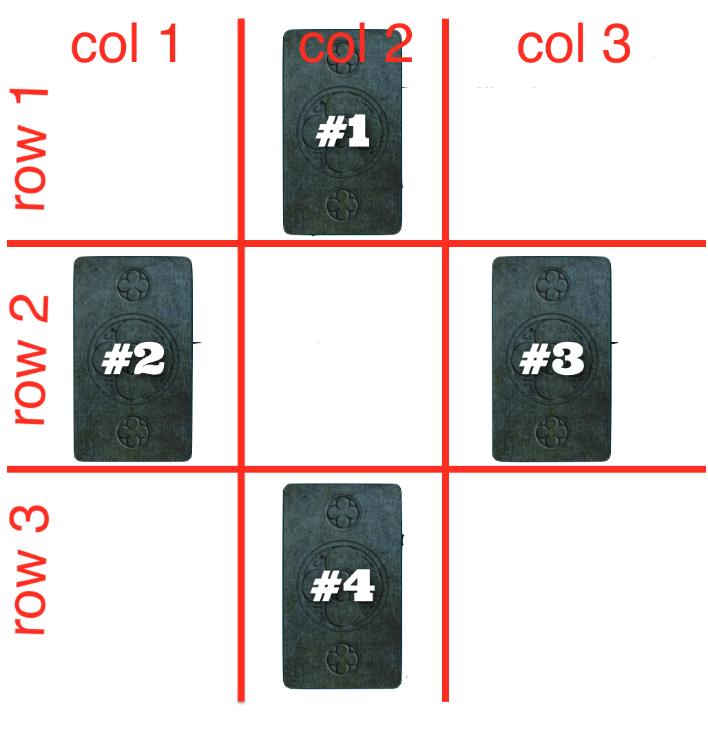
Card 1:
  grid_column: 2, grid_row: 1

Card 2:
  grid_column: 1, grid_row: 2

Card 3:
  grid_column: 3, grid_row: 2

Card 4:
  grid_column: 2, grid_row: 3
Now I can pull these attributes dynamically when the reading is rendered.
Requirement: Shrink or grow the size of the spread area to fit any size reading
Some readings spreads have 1 card, some have 10. Depending on the shape of a particular spread, we may need a 1x1 grid, 3x3, 4x4 etc. At first, I just made a big grid because why not make one big enough to hold the biggest reading spread? As it turns out, when I made the grid the static size of 100x100, there was a lot of extra blank space on the page where the empty grid cells were. Ooof.
In order to overcome that, I decided to render this grid size dynamically like I did with the individual card positions. I added some fields to the readings database table (grid_columns and grid_rows) to store this data and then I manually filled in this data for each reading. The data for our reading spread looks something like this for a 3x3 grid:
grid_columns: 3
grid_rows: 3
Requirement: Make flexible, reusable classes for building grids and positioning cards on the fly
Currently our grid class is completely committed to being a 3x3 grid, always.
.grid-container {
  display: grid;
  grid-template-columns: repeat(3, 1fr);
  grid-template-rows: repeat(3, 1fr);
}
How did I shove a dynamic value into this class so it can be whatever size I want? Well, I didn’t. After reviewing the shapes of all of my reading spreads, I built a library of utility classes for grids of sizes up to the largest grid I needed. Now I can swap out classes on the fly by breaking the original grid-container’s properties into different classes. Here is a sample of some of the classes I wrote – these are the classes that are relevant to our example grid:
.grid-container {
  display: grid;
}

.grid-container-3-col {
  grid-template-columns: repeat(3, 1fr);
}

.grid-container-3-row {
  grid-template-rows: repeat(3, 1fr);
}
And then by applying multiple classes in the HTML, we’re able to achieve the same result as having the single class with all of the properties in it.
<!-- How it looks in plain HTML -->
<div class="grid-container grid-container-3-col grid-container-3-row">
  <!-- cards go here -->
</div>

<!-- How it looks in ERB with dynamic values -->
<div class="grid-container grid-container-<%= @reading.grid_columns %>-col grid-container-<%= @reading.grid_rows %>-row">
  <!-- cards go here -->
</div>
I took that same approach for positioning the cards dynamically.
/* Instead of a single class for each possible position on the grid... */
.card-1 {
  grid-row-start: 1;
  grid-row-end: 2;
  grid-column-start: 2;
  grid-column-end: 3;
}

/* I made classes for each column and row address on the grid */
.grid-col-2 {
  grid-column-start: 2;
  grid-column-end: 3;
}

.grid-row-1 {
  grid-row-start: 1;
  grid-row-end: 2;
}
Again, applying multiple classes to the cards achieves the same result as having the single class with all of the properties in it. This is the whole enchilada as it appears in the HTML:
<!-- How it looks in plain HTML -->
<div class="grid-container grid-container-3-col grid-container-3-row">
  <div class="grid-col-2 grid-row-1">
    <p>#1</p>
  </div>

  <div class="grid-col-1 grid-row-2">
    <p>#2</p>
  </div>

  <div class="grid-col-3 grid-row-2">
    <p>#3</p>
  </div>

  <div class="grid-col-2 grid-row-3">
    <p>#4</p>
  </div>
</div>

<!-- How it looks in ERB with dynamic values -->
<div class="grid-container grid-container-<%= @reading.grid_columns %>-col grid-container-<%= @reading.grid_rows %>-row">
  <% @reading.positioned_cards.each do |card| %>
    <div class="grid-col-<%= card.grid_column %> grid-row-<%= card.grid_row %>">
      <%= card.position_number %>
    </div>
  <% end %>
</div>
And that’s the stuff right there! 🎉 I’m still able to easily loop over the cards in the reading, but now they all have their position information stored in the database with the card itself and all of it points to a set of CSS utility classes to make the grid magic happen. 🔮 🪄 I’m feeling pretty proud of myself.

Bonus Round!
The hard work is over, so now it’s time to flex a little to get those final touches in place.
Bonus Requirement: Overlap certain cards’ rows or columns so that the layout actually looks like a real tarot spread
Now for the tricky part. How do you get cards to look overlapped like this if a grid is made of columns and rows that don’t overlap?
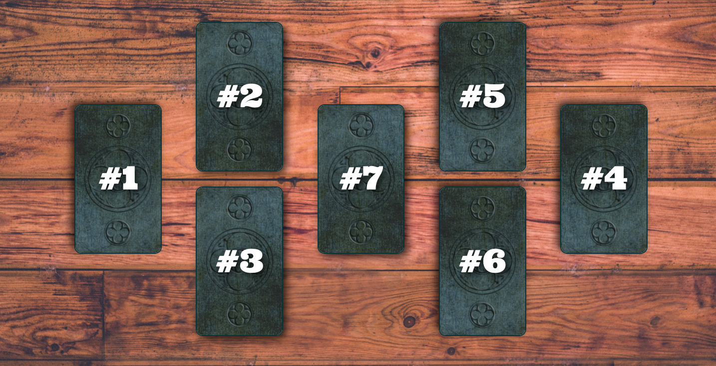
This was a real headscratcher. I redesigned my grid concept to have twice as many columns and rows and then refer to the overlapping locations as “half” locations. 🤯
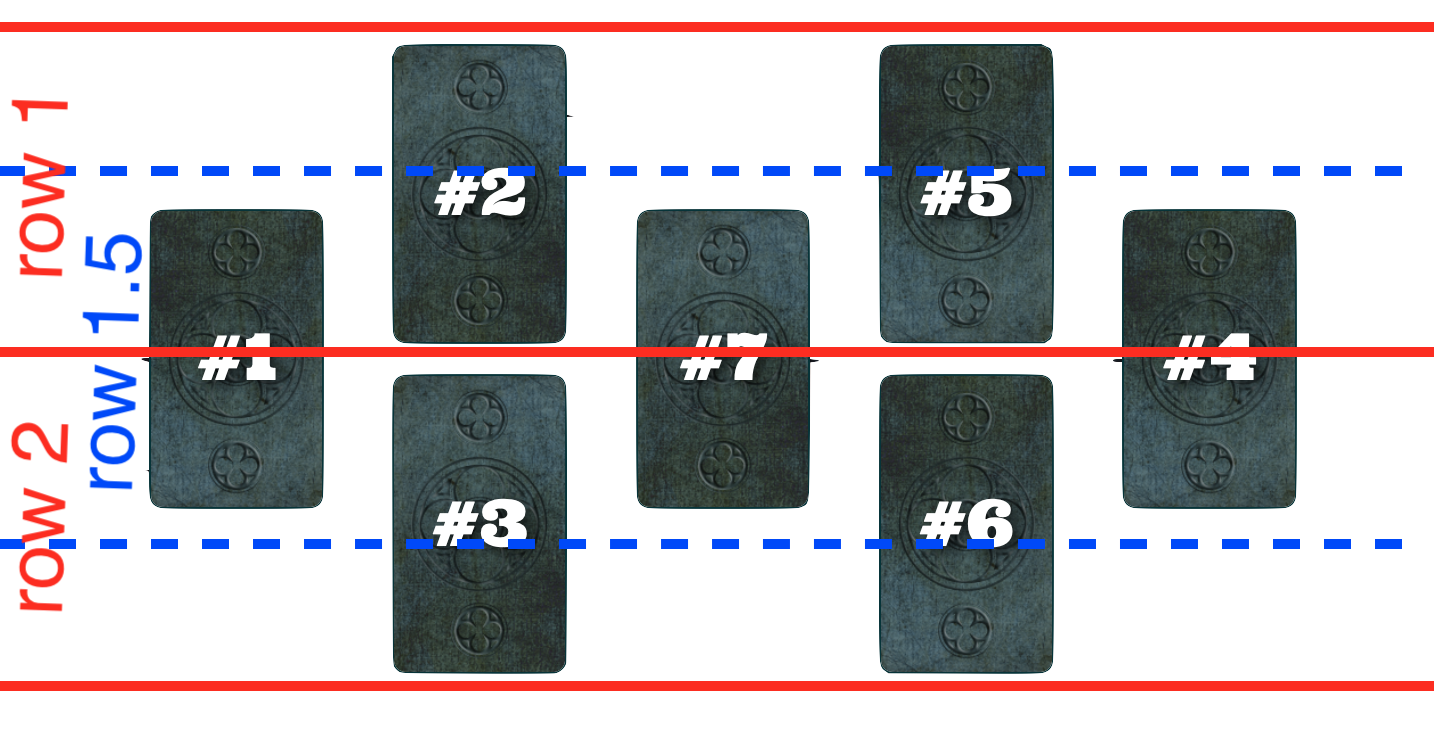
So the data for this reading spread looks something like:
Card 1:
  grid_column: 1, grid_row: 1.5

Card 2:
  grid_column: 2, grid_row: 1

Card 3:
  grid_column: 2, grid_row: 2

Card 4:
  grid_column: 5, grid_row: 1.5

Card 5:
  grid_column: 4, grid_row: 1

Card 6:
  grid_column: 4, grid_row: 2

Card 7:
  grid_column: 3, grid_row: 1.5
And then I built out the corresponding CSS classes to match.
Bonus Requirement: Cross a card (rotate 90 degrees) over another card
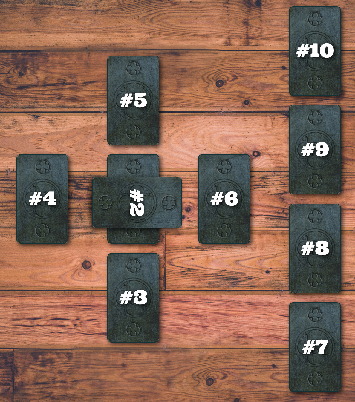
Okay, now in this spread, notice how card #2 is crossing over card #1?

The first part is easy. When entering the positioning data, I simply assigned cards #1 and #2 to the same place in the grid.
Card 1:
  grid_column: 2, grid_row: 1

Card 2:
  grid_column: 2, grid_row: 1
Voila. But then I needed to add another column to my reading_positions table to indicate if a card in this position should be crossed. I tossed a boolean called crossed in there and was good to go. As for the styling, I wrote a class that rotated the card and rendered that class in the HTML if the reading_position.crossed? was true.
.crossed {
  -ms-transform: rotate(90deg); // IE 9
  -webkit-transform: rotate(90deg); // Safari 3-8
  transform: rotate(90deg);
}
Now that we have ovelapping cards (with those half columns and half rows) and crossed cards (rotated 90 degrees), we can render the classic Celtic Cross spread!
In Summary
| Before Grid | After Grid |
|---|---|
 |
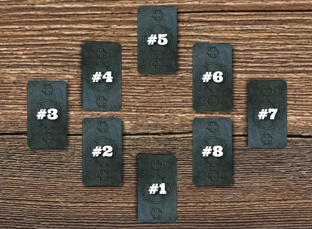 |
| The cards are rendered into generic non-customized columns and rows. | The cards are positioned exactly where I want them to be. |
This refactor was satisfying because it solved a problem that I had stopped thinking about solutions for a long time ago. It took some creative problem solving to figure it out and the results are so pretty! I’m glad to have gotten the inspiration I needed to finally endeavor on this long-overdue refactor.
Of course, the next set of feature I want is already in my mind: when I use the admin interface to create a new reading spread and fill in the grid size and card locations, I have to picture a grid in my mind (complete with half rows and half columns 😱) or use a whiteboard to figure it out. I would love to be able to click on a square in a grid on the form page or drag and drop a card to a grid location. Right now, that’s outside of the limits of my desire to do this work 😂 and I don’t see myself building a whole lot more spreads right now, so we’ll see how many more years it takes for me to get around to implementing that admin feature.